TRIPCASTR
PLAN . PACK . FORCAST .
My contribution:
UX|UI Designer/Researcher
Project Manager
Client:
Stakeholders (General Assembly)
Team:
Team of 4
Timeframe:
2 weeks

OVERVIEW
The Context
Our group of four was given an initial "prompt" that highlighted a specific issue a user was facing. Using this prompt provided by the instructors, we branched off and conducted our own research methodologies in order to create what is known today as TRIPCASTR.
PROBLEM/PROMPT
SOLUTION
PRIMARY RESEARCH
SECONDARY RESEARCH
C&C/FI/EA
USER FLOWS
SOLUTION
USABILITY TESTING
Learning our users
We set out to interview particularly sporty and adventurous people in order to gather the most accurate data. This user group was decided to be the most efficient route to take, as we would be gathering insights about our target user group: people who somewhat regularly go on trips.
8 users interviews
to view in full detail please open the full affinity map here.
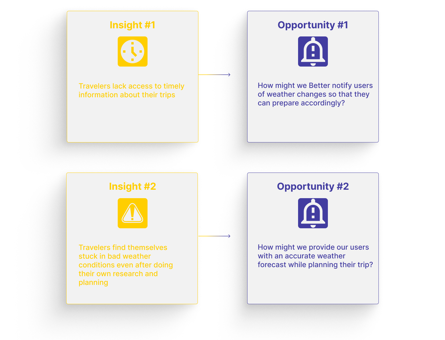
Using the data gathered with our user interviews we went through a affinity mapping exercise with the whole team & gathered some Insights that played a big role in the development of our solution.
Utilizing all the resources


Before creating our app, we looked at other travel apps to get ideas and improve our app's features and user experience.
Following a thorough analysis of our competitors, which included comparative analysis, feature inventory, and element analysis, we gained valuable insights that informed our design decisions. Our assessment included the review of Weather.com, Accuweather, WeatherBug, the iOS Weather app, the Jackson Hole website, and the National Parks Service website.
we used various different methodologies we planned out to find how our direct and indirect competitors were doing things. These 4 are just a couple of the competitors we conducted feature inventory and C&C for.
Breaking the steps down to achieve the MVP (Minimum Viable Project)
To ensure the creation of an accurate and useful app for our users, our team developed two user flows that comprehensively address the needs of our entire target audience. These user flows have allowed us to test and identify potential pain points and areas for improvement in our app's design.


15 day forecast before, during, and after trips along with notification alerts for unexpected weather changes.
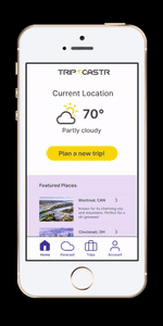
Based on the research we gathered, along with 2 user flows, our team came together and created the starting point for our app, where we addressed our main issues. The first issue we solved was based on the research finding that the majority of our users have experienced a trip during which unexpected weather changes occurred. To address this, we created a mobile app that provides weather data for a specified location when planning and while on a trip.

Measuring Impact
To evaluate the usability of the new app design, we performed one round of testing each with 6 participants. During the tests we requested that users perform tasks within the app to determine if the design was intuitive for them. the questions we asked included…
You are going to Breckenridge from April 16th-23rd and you want to create a new trip
Fill in trip information
You will be skiing, and hiking as your activities
Add a shirt and pants to your suitcase
Navigate to the homepage
You’re on your trip, you get a notification that the weather has changed and You want to change the activities you’re doing that day

Homepage updates
The only changes that were needed for our homepage were visual design changes. our team noticed users were subconsciously hesitating a little on the homepage. in order to make the process as intuitive as possible we re structed the center display.

Weather updates
In order to keep the app as intuitive as possible we moved the plan trip button off off the sliding graphs.
Next Steps
Develop Web & Smartwatch Versions
43% Use Web to Plan
29% Wear a Smartwatch
Research More Weather Features
Check Forecast along Specific Routes
Extreme Weather or Natural Disasters
Incorporate other Data About the Area
Road conditions
Local regulations
Nearby attractions
More User Research & Usability Testing
Further R&D will allow refinement to our latest version
Takeaways
our team also realized how our add trip button looked less accessible without text to support it along with the pictures and words being a little too confined. This project helped me begin to understand that accessibility in design is extremely important and should always be looked at carefully before approving designs
Homepage updates
The only changes that were needed for our homepage were visual design changes. our team noticed users were subconsciously hesitating a little on the homepage. in order to make the process as intuitive as possible we re structed the center display.

Trip page updates
our team also realized how our add trip button looked less accessible without text to support it along with the pictures and words being a little too confined.

Breaking the data down
KEY INSIGHTS

Design a product to help travelers acclimate quickly for a seamless trip.
Based on the prompt, our team went out and conducted user interviews with 7 different participants. We also conducted various secondary research, such as C&C and feature inventory. Using the data gathered, we synthesized 2 personas along with a problem statement.
Plan . Pack . Forecast.
We have created a mobile app that provides weather data for a specified location when planning and while on a trip. The app offers options for activities and suggestions for gear to pack, ensuring that the user never misses a moment of excitement.